Visualizing & Evaluating Image Synthesis GANs
Evaluating GANs (Generative Adversarial Networks) is difficult – unlike classification problems there is no final accuracy to compare against, for instance. For my OpenAI Spring Scholars project, I focused on different ways to understand and evaluate image synthesis GANs, using the approach of Distill’s Activation Atlas.
Motivation & Research Background
My interest in delving into GANs stems from having worked with them previously to provide visual content for a VR application. At that time, we struggled to find ways to objectively measure the effectiveness and quality of the images generated. Without such an indicator, one can spend oodles of time trying to figure out what works and what doesn’t - and enmeshed in subjective debates about which imagery is more “believable”, “creative” or “impressive”. And spending such time isn’t just a cost in your own time (& sanity) but in real cost of compute in training your models.
Also, as GANs become better and better, measuring and defining quality becomes more problematic - for example how do you judge the quality of the hyper-realistic StyleGAN picture below? At first glance it looks amazingly real and a world on from the first steps in GANs in 2014 (when first proposed by Ian Goodfellow). However when considering use of visuals in VR, avoiding the “uncanny valley” is a constant pressure: deep, immersive visuals can have such huge impact, and yet “close but not quite” is sometimes significantly worse than comically unreal. In short, the uncanny valley was coined by a robot researcher, Masahiro Mori, in 1970 as a way of capturing our very real revulsion toward things which appear nearly human, but not quite. It is often researched in regard to robots, but also can be observed in our reaction to computer graphics, images and corpses for example.
On the curve of Chart 1, we can see that as we move from left to right our familiarity (think comfort level) with things steadily increases along with an increase in human likeness. So, as a basic robot arm grabs something and look industrial we have little attachment to it, and are neutral toward it. As that robot becomes more humanoid we increase our familiarity and comfort with the object - until, at a certain point, the robot becomes too real and not-real-enough all at once. And at that point, our comfort level drops below zero and we are repulsed by the object - far worse than our neutral response to the basic industrial robot we began with. Much research continues to go into understanding and overcoming the uncanny valley - and as technology leaps forward things keep improving - witness phenomena lilmiquela. However, the challenge brought home to me how evaluating a synthetic creation is intrinsically tied to understanding why the original image/object works in the first place. As I read more and more about GANs over the last 12 weeks, this challenge came back to me.

“When you can measure what you are speaking about, and express it in numbers, you know something about it”
As said, evaluating GANs is notoriously difficult. There exist a multitude of options for attacking the task - Borji critically reviewed 24 quantitative and 5 qualitative measures for instance. Approaches range from those that evaluate the sample outputs from GANs to ones which evaluate the performance of the Discriminator and/or Generator in downstream tasks. (I highly recommend both “Are GANs created equal?” & “A Note on the Evaluation of Generative Models” for more grounding in the area).
However, the two metrics most used to benchmark GANs today are the Inception Score (IS) and the Fréchet Inception Distance (FID). Both of these metrics are based on using a highly trained classifier network (Google Inception) in order to evaluate the quality of generated images from GANs. The IS compares the conditional label distribution to the marginal label distribution of samples generated by a GAN - essentially trying to measure how good the GAN was at generating samples across a variety of class and also how well it was able to ensure a strong probability within a class. A higher IS score is better.
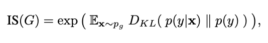
IS score from A Note on the Inception Score
The FID measures the Fréchet distance between the sampled and original distributions, assuming a multivariate gaussian distribution that can be explained with the two moments mean & covariance. My favorite (intuitive) way of understanding the FID came from part of the explanation on Wikipedia - one can think of the Fréchet distance between two curves in terms of a person walking their dog on a leash. The Fréchet distance between them is the minimum distance required to keep the leash precisely tight while walking even around a corner. A lower FID score is better. In technical terms for GANs it can be seen as:

“There are three kinds of lies: lies, damned lies, and statistics”
I came to Deep Learning from the less-often traveled road of business - a road that instilled in me a deep suspicion in the ability of convenient metrics to adequately explain a complex problem. Rather, I like to think of each statistic available as a trade-off. Much like the movie Argo (memed and adapted below), metrics for the evaluation of GANs provide us with a multiplicity of imperfect options, of which, currently the best option seems to be the FID score. By the way, the authors of these papers, are themselves, quite self-effacing and open about the difficulties in evaluating GANs & the continual search for new and better ways to do so.
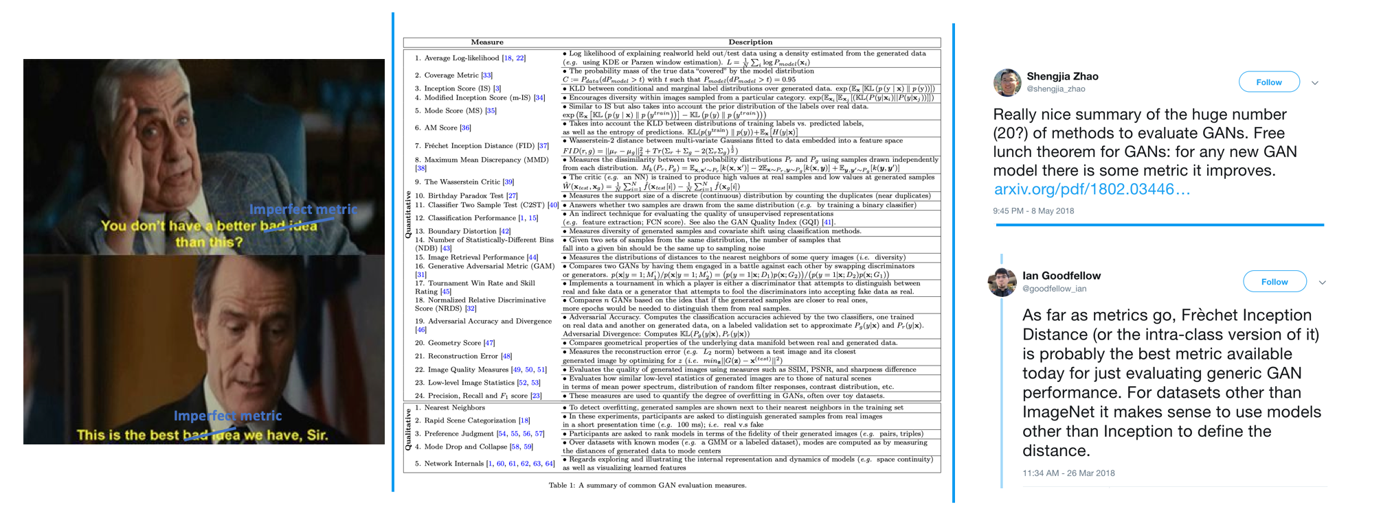
The way in which metrics are applied is not uniform. For instance BigGan evaluated FID score using InceptionV2 network rather than the original V3 network per the paper; SNGan used 5k samples. The metrics themselves also have limitations. For example, the inception score can misrepresent performance if it only generates one image per class, since the marginal probability will be high even though the diversity is low. However, most importantly, from my perspective, is the fact that I was no closer to understanding the mechanics of these networks after viewing single scalar statistics. And I very much wanted to understand. I wanted to take apart the clock, understand how it works, and put it back together again.
“Tell me & I’ll forget, show me & I may remember”
So it was perhaps natural that during my time at OpenAI, I was attracted to the work that the Clarity team was doing, specifically the Activation Atlas. Their words are better than mine in terms of intent, specifically:
Modern neural networks are often criticized as being a “black box.” Despite their success at a variety of problems, we have a limited understanding of how they make decisions internally. Activation atlases are a new way to see some of what goes on inside that box.
Here was an opportunity to take an area of new research (the Activation Atlas debuted in March) and try to apply it to an open problem in GANs. The intent was to have a readily interpretable visual aid to understanding differences between original and sample distributions, without any assumptions about the underlying distributions. (From a personal perspective, the intent was also to pull apart a neural net from the inside out and try to better understand its workings.) So, whoa nelly, I didn't know the wormhole I was going to disappear into for the next 4 weeks…
Methodology & Experiments
In order to construct Activation Atlases for this project there were 6 broad steps as outlined below:
Generate GAN Samples
Collect Spatial Activations & Calculate Logits
Dimensionality Reduce the activations
Apply Grid
Calculate the distribution densities by grid
Construct Activation Atlas(es)
Generate GAN Samples:
For this experiment I wanted to use the InceptionV1 (GoogLeNet) classifier network so as to be in line with current work by the Clarity team. This means that the images and samples used for evaluation would need to come from ImageNet or ImageNet trained GANs. Thankfully, Google recently released the full trained BigGan Generator (as I did not have the city of Cleveland power to train one in 4 weeks!) The authors of SNGan also released their fully trained Generator - so I had 2 ImageNet trained Generators to work with.
I used the Generators as provided, in the original environments (e.g, Chainer for SNGan) and followed the guidance provided in their repos - I hope I have done justice to their work. I would like to thank the authors of BigGan and SNGan for being so open with their findings and models - beyond open sourcing their Generators they have spent much time on Reddit &/or Github speaking with people openly about their work and it was a great resource to read.
I won’t stress the scale of working with ImageNet (downloading it, managing it and the like) - but suffice to say I truly understand why innovations like Imagenette are so helpful now.
2. Collect Spatial Activations & Calculate Logits
This is the guts of the Activation Atlas - essentially we take one spatial activation sample per image per layer. From this information we get a snapshot of how the network is representing the image in the hidden layers. The original Activation Atlas sampled 1 million images which is most robust, but they found that at 100k images the findings were “sufficient”. As I was working with three datasets, this meant working with 300k images in the system at anyone time and comparisons between 2 datasets are made from 200k total samples (100k per dataset).
In order to collect activations, we simply make a forward pass of the InceptionV1 network and sample the activation vectors. At the same time, we can also take a snapshot of the logits at that same point in order to later make an approximation of how grid cells (and the activation vectors contained within) effect the overall logits. As the Lucid library provides a number of helpful functions (for e.g., providing an interface to the Inception model!), I worked in Tensorflow for this project - Lucid is, for now, strictly a Tensorflow affair.
3. Dimensionality Reduce Activations
By the time we have one spatial activation sample per image, we have a tonne (technical term) of activation vectors. For instance by layer “mixed5a” the output shape is 7x7x1024 so we have 300k activation vectors of 1024 dimensions to work with. While I am a huge proponent of 3D and moving out of the restrictions of 2D space…1024D space is hard to fathom. So in order to better understand, visualize and approach this data, some form of dimensionality reduction is required. Like the original Activation Atlas implementation I used UMAP - Uniform Manifold Approximation & Projection. I won’t belabor the choice here as I have a separate blog post on UMAP. However the choice was driven by two major considerations: 1) consistency with original implementation; 2) speed - UMAP is faster than t-SNE to compute. Unfortunately the nature of the data I was working with pushed UMAP to its limits and so I had to work with the latest Github repo for access to a recent change on the recursion in projection initialization. As such, I was on the CPU - but there is a RAPIDS NVIDIA GPU enabled UMAP which is much faster.
4. Apply Grid & Count Activations by Cell
Having reduced the data to 2D with UMAP we are left with a large, dense, scatterplot in essence … it is much easier to understand if we further “bin” the data into grid cells in order to understand groupings & clustering. For this, I worked with grids of sizes 10-320 to test and found that the 20,40,80 sizes were reasonable for both comprehension and stability of KL metrics.
5. Calculate the Distribution Densities by Grid
As simple as it sounds, we then count the number of dataset entries in each grid bin. I found that the KL divergence was helpful getting an overall guide to the atlas and how things compared across layers. However, ultimately once I was able to navigate an atlas I found that interrogating grid cells in greater detail was more helpful to understanding things.
6. Construct Activation Atlas(es)
Having created these grid bins we can then create a single, iconic representation for each of them - the stunning visuals that bring the Activation Atlas to life. These are created by averaging the activation vectors in the grid cell and then performing feature optimization to create a representation of an image that most excites an output activation like those we observe.
For anyone embarking on an Activation Atlas of their own I will note there are 3 bottlenecks of compute - UMAP, Activations and Icon generation. (The latter 2 taking significant GPU resources). The rest of processing can be sped up enormously with CPU multiprocessing. Also, the Lucid library is a wealth of information and code that can be used to build an Activation Atlas (or to perform various visualizations - check out the 3D modeling work!). A lot of the complexity in my experiments stemmed from wanting to compare multiple datasets and add comparative density statistics into the pipeline which meant I could not use “out of the box” Lucid.
Findings
Dimensionality Reduction
I found that the dimensionality reduction with UMAP was most sensitive to the nearest_neighbors & min_distance parameters as you can see in the excerpts below. Ultimately, in order to ensure consistent comparison between datasets, I chose to fit and transform the data in one step (rather than fitting to the Imagenet space & then transforming the 2 GANs into it). The reasoning being that some features of the data may be a lot easier were I able to do the latter. However I found that transforming the data into the ImageNet space led to a certain amount of boundary issues (similar to this issue).

Excerpt from Umap experimentation with hyper-parameters - most sensitive to nearest_neighbors & min_distance parameters
Feature Visualization
Creating the iconic representations for each grid cell was fun, to be honest. I haven’t had the opportunity to use compute at this kind of scale before and so playing with the approaches was truly enjoyable. I wanted to keep to the approach the original Activation Atlas took for comparability reasons. However, I still undertook a number of experiments to ensure that this approach worked well for my data (and to learn!). When transforming a noise image into a representation of the activations within a grid cell we are essentially searching for an image that the network finds exciting - an input that would result in the output (activations) that we already know exist in that cell. Distill has amazing articles on the topic that I can’t do justice to here on the blog - I highly recommend them if you are interested.
But one of the big issues with performing feature visualization by optimization is that of regularization. If we continually refine a noisy image to maximally excite a network we will end up generating adversarial examples or the like. Additionally, the main point of creating these visualizations is to find human-interpretable ways to view the hidden representations of a network - and as humans we don’t do well with high frequency visuals. As such most papers on feature visualization spend a great deal of time discussing the regularization techniques employed to ensure the visualizations are robust and interpretable. (For, with too much regularization we could remove the very nuances we seek to understand…)
I focused on experimenting with transform robustness and learned priors per the original Activation Atlas implementation. Transform robustness, as it sounds, ensures that a visualization is not highly dependent on only one viewpoint of the input - employing techniques of jittering, rotation and so forth. Learned priors is, as it sounds, about adding additional information into the visualization process. In line with the Activation Atlas implementation I ended up using a level of whitening to de-correlate inputs - in the chart below you can see in column 3 that the icons produced without whitening struggled to produce details. I also experimented with reducing jitter, number of optimization steps taken, size of icon produced. And perhaps as no surprise to anyone found that 1) the implementation from the original paper produced the best results and that 2) increasing the time and scale of processing also significantly improved the outputs.
For anyone particularly interested in the visualization params I employed and how they differed to the original implementation: Images were optimized for 1024 (vs original 2560) steps in a color-decorrelated fourier-transformed space, using Adam at a learning rate of 0.05. Transformations included:
• Padding the input by 16 pixels to avoid edge artifacts
• Jittering by up to 16 pixels
• Scaling by a factor randomly selected from this list: range(-5,80)
• Rotating by an angle randomly selected from this list; in degrees: range(-20,19)
- vs smaller range in original implementation for both scaling and rotation
• Jittering a second time by up to 8 pixels
• Cropping the padding
Comparison visuals from some of the feature visualization experiments run.
KL Divergence
I was somewhat surprised that the KL divergence between the GANs and ImageNet was most pronounced in the early layers mixed3a & mixed3b. It is so pronounced that I have to view the later layers on a different scale to understand the differences shown. As you can see below both SNGan & BigGan diverge significantly from ImageNet early on but come more into line with it throughout the network (deep red fading to cool blues). In contrast, if we view the divergence between SNGan and BigGan (Figure 3 at bottom), we see that the greatest divergence between the GANs occurs in the later layers - especially mixed 5b. I am still working on the details of why and how these divergences occur in this way, but some emerging thinking is below:
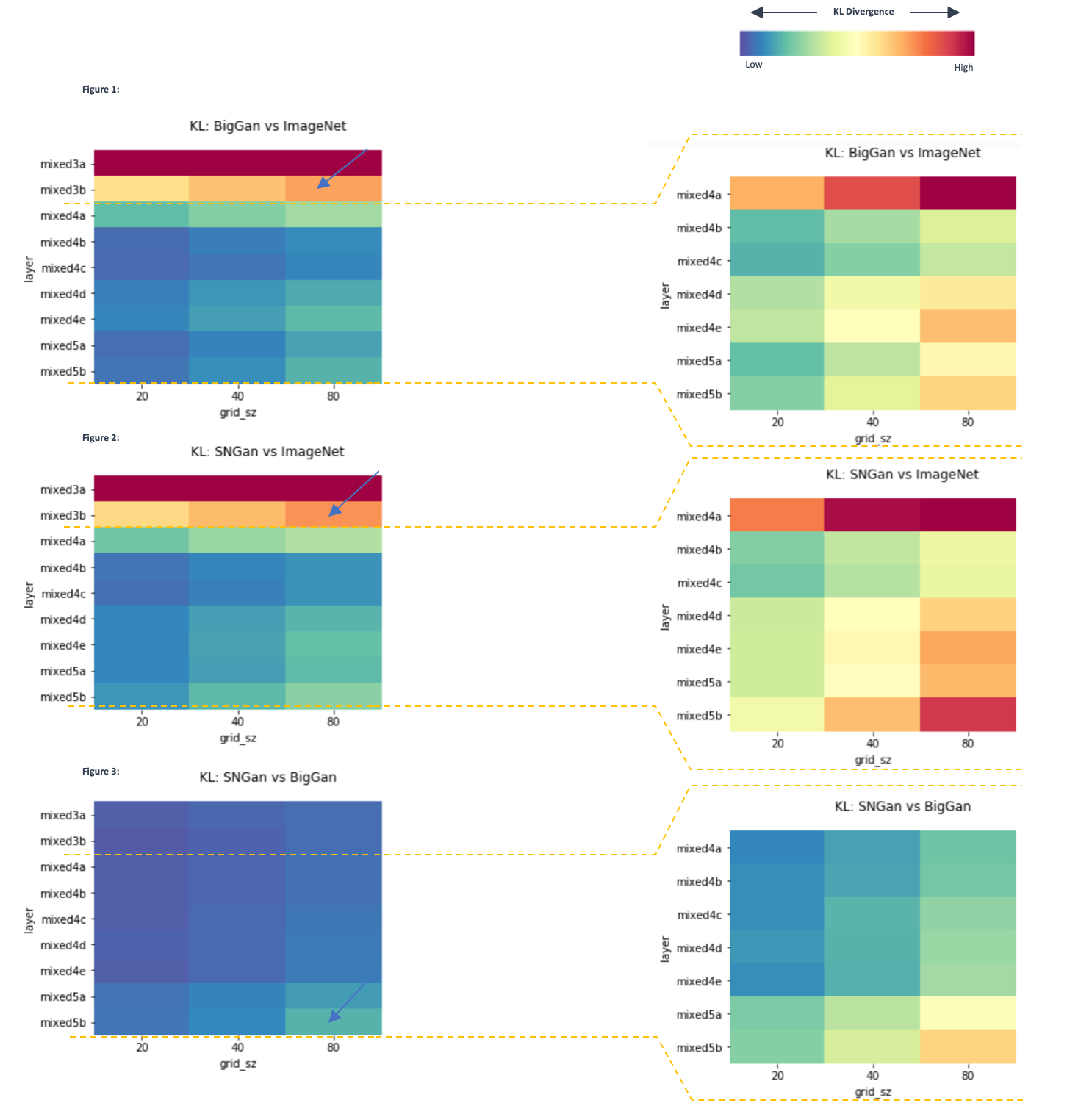
Heatmaps for the KL divergence between sample distributions at given grid sizes; At left scale is large (0-1.5) and is dominated by the divergence in early layers mixed3a & mixed3b. At right, early layers are removed & tighter scale (0-0.4) used to better see the divergences. Arrows pointing to areas of interest/key divergence.
Activation Atlas
So, here we are - an Activation Atlas! In analysing 3 datasets across 9 layers & 3 grid sizes there are a lot of atlases to consider. Ultimately, I am working to bring it to life with an interactive online viewer like the original implementation that allows a user to flip through to those parts/views of most interest. So, for now I am showing my top favorite Atlas in static form below. Layer mixed3a, highlighting the divergence between ImageNet and BigGan distributions on a 40x40 grid. You can see on the LHS the large dark red mass where ImageNet has significant density & BigGan has very little to no presence. As this is a very early layer in the network it focuses more on key textures, colors and shapes rather than detailed object representations so I am fascinated by the strong divergence here.
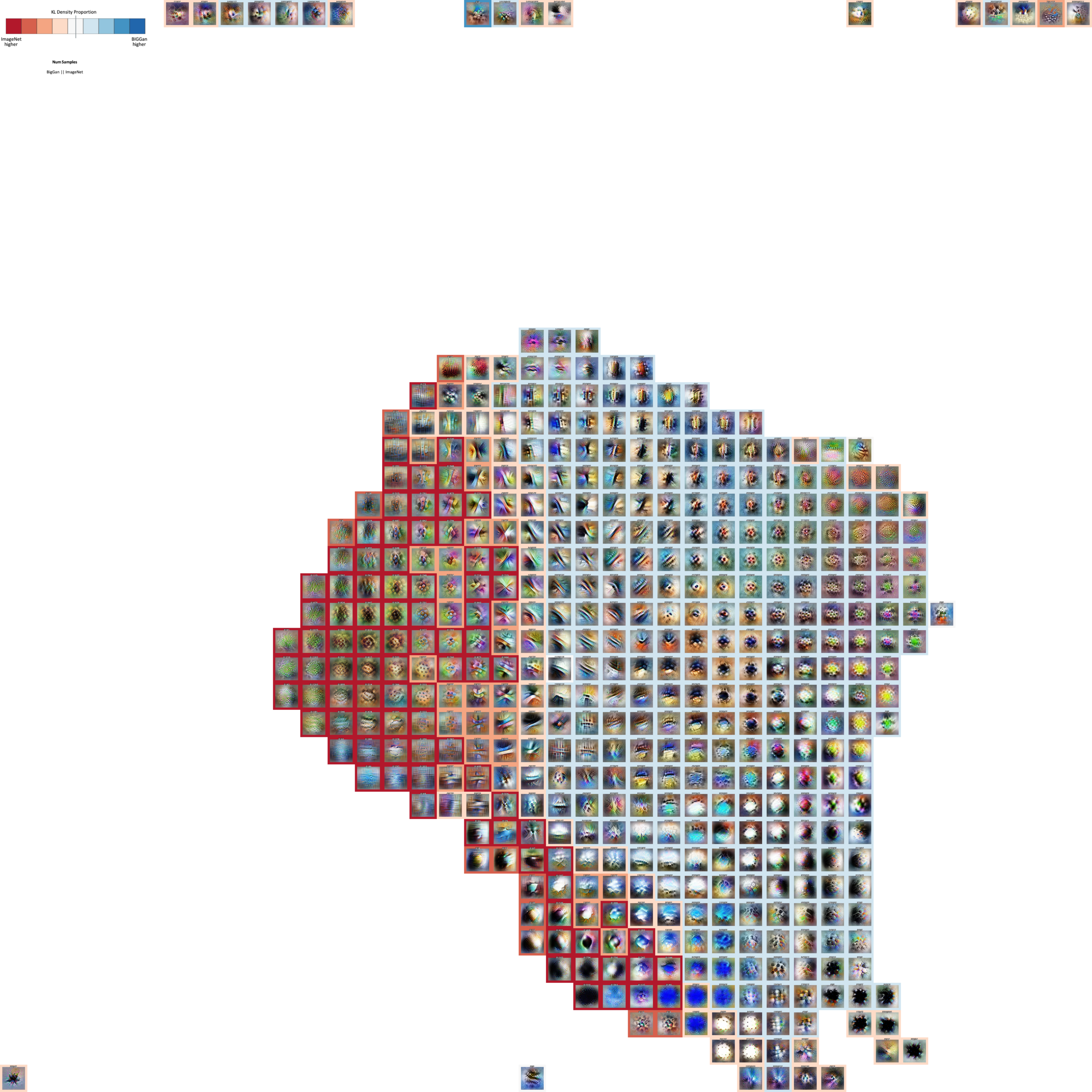
Activation Atlas for Mixed3a, Grid Size (40x40).
Colors represent KL density proportion between BigGan & ImageNet - for example, red cells show places ImageNet density far exceeds that of BigGan. Numbers represent the count of samples per activation grid square in order: BigGan || Imagenet.
NB: for this version I am not including the areas of logits but will do in the version released as I am running some sanity checks on the usage of multiple dataset logit responses.
On further inspection it seems that it may reflect the fact that the GANs are not producing textures in the fine grained way that high-res Imagenet data does. Take the dataset examples below:
On the LHS (red) is Cell (15,11) - the highest divergence cell in the layer where 1302 activations lie for Imagenet but none for BigGan. Next to it are a number of Imagnet dataset examples showing first the full ImageNet original image (left) and beside it the spatial “patch” that the activation we sampled relates to. We can see that it seems to focus on fine grained details. Not just “grass” but long, lush grass. Or at the bottom the fine texture in a placemat or wall. On analysis the top labels represented in this cell for ImageNet were “hay” and “manhole cover”. So I interrogated the data to find the cell where the highest proportion of ‘hay’ images are represented for BigGan. This takes us to the other side of the map where we can see cell (20,32) where BigGan has a much higher density than ImageNet. Looking at the BigGan dataset samples from the grid cell we can see the same sort of ‘textures’ appearing (grass, even the texture of the grey sweater), but that they are more blurry than the images at left. This seems to show that the Activation Atlas has separated the fine grained details on the left from the more blurry textures on the right. I am currently exploring how to scale comparisons like this for more interrogation of the Atlases.
ImageNet dataset examples for cell (15,11):

Mixed3a, Cell(15,11) in 40x40 Grid: Dataset examples & spatial activation slices taken from ImageNet during experiment
BigGan dataset examples for cell (20,32):
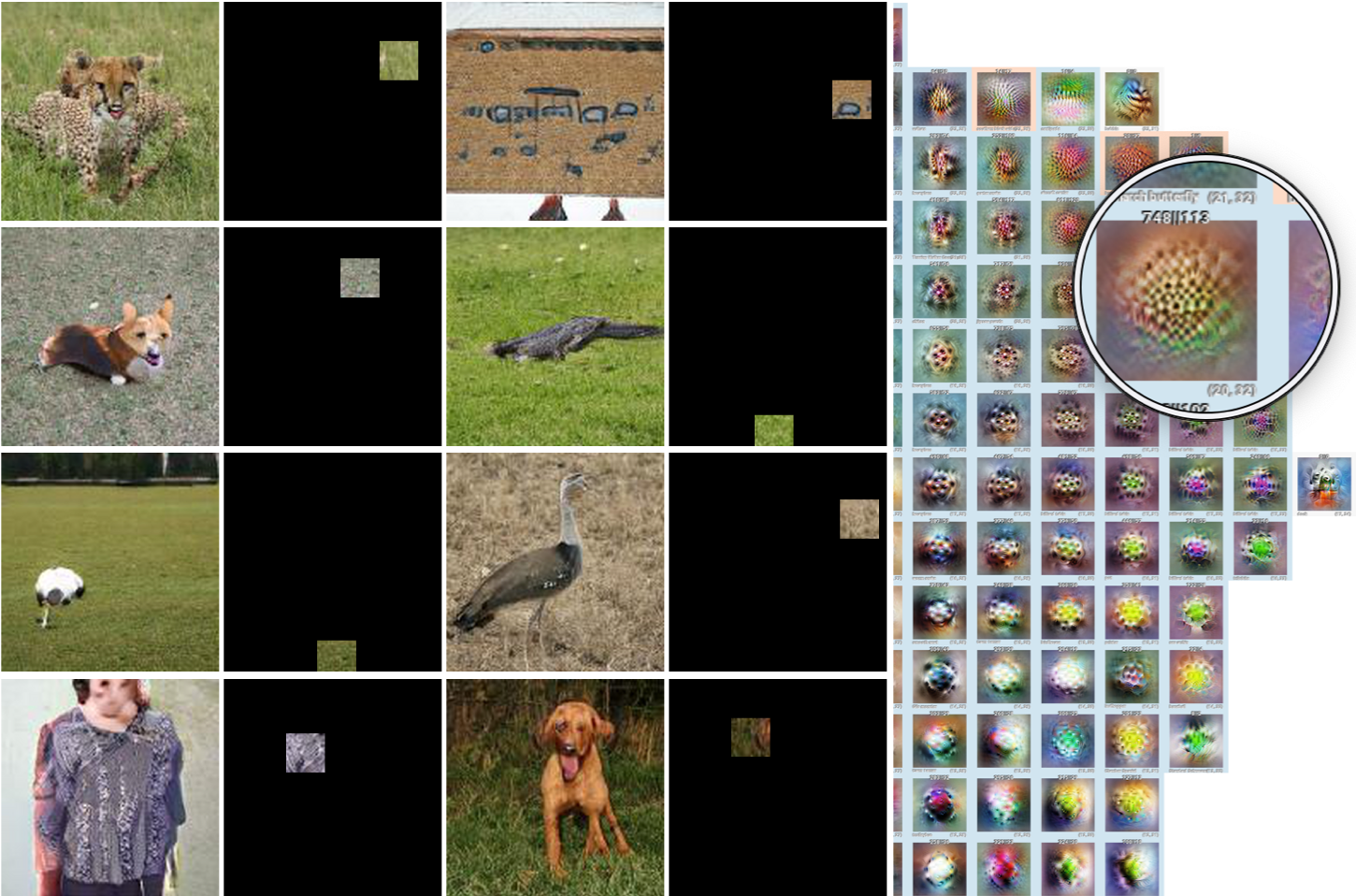
Mixed3a, Cell(20,32) in 40x40 Grid: Dataset examples & spatial activation slices taken from BigGan during experiment
Next Steps & Future Directions
The difficulty of working with such large amounts of data (even with the brilliant approach of the Activation Atlas) means that strong UI doesn’t just present the work in a good light but goes hand in hand with evaluating the data. As I build out a better interface, I feel that it will bring more insights to life. It is fascinating that there is such a divergence between the original images and GAN samples so early on in the network - a finding I found quite surprising. I am continuing to look at other ways to better understand the Atlases and to dig into the differences across the map with reference to both the dataset samples and the logits in the model.
Acknowledgements
I am deeply grateful for the amazing opportunity that the OpenAI Scholars Program provided. In particular, I would like to thank my mentor, Christy Dennison, and Maddie Hall for their insights and mentorship over the 12 weeks. As well, I would like to take the opportunity to thank the Clarity team - in particular Chris Olah and Ludwig Schubert who have been so open and generous, both with their time and also their wisdom. My fellow scholars cohort have been a blast and it has been an honor to work with them. Lastly, I would be remiss if I did not thank AWS for the generous credits which allowed me to run these experiments.